
How Typography Choices Affect Restaurant Websites
Did you know that 88% of consumers won’t return to your website after a single negative experience?
If you’ve ever wondered why visitors leave your restaurant website without booking a table or placing an order, the answer might surprise you. Sometimes the issue has nothing to do with your food photography or menu prices. Often, the problem lies in your typography.
The fonts you choose, their sizes, and how they work together on your page directly affect whether customers can read your menu, trust your brand, and complete orders. Poor typography can make your site feel unprofessional and difficult to navigate on mobile devices.
At PBR Web Design, we’ve helped hundreds of restaurant owners fix this problem. The role of typography goes beyond aesthetics and affects whether your website design converts visitors into customers.
In this article, we’ll break down why typography shapes customer behaviour, which mistakes kill conversions, and how to fix them. Ready to learn more about restaurant website readability? Let’s get started.
Why Restaurant Website Readability Makes or Breaks Online Orders
Most people decide within 10 seconds whether to stay on your site. If they land on your page and struggle to read your menu because the fonts are too small, too fancy, or poorly spaced, they leave. The numbers back this up as well.

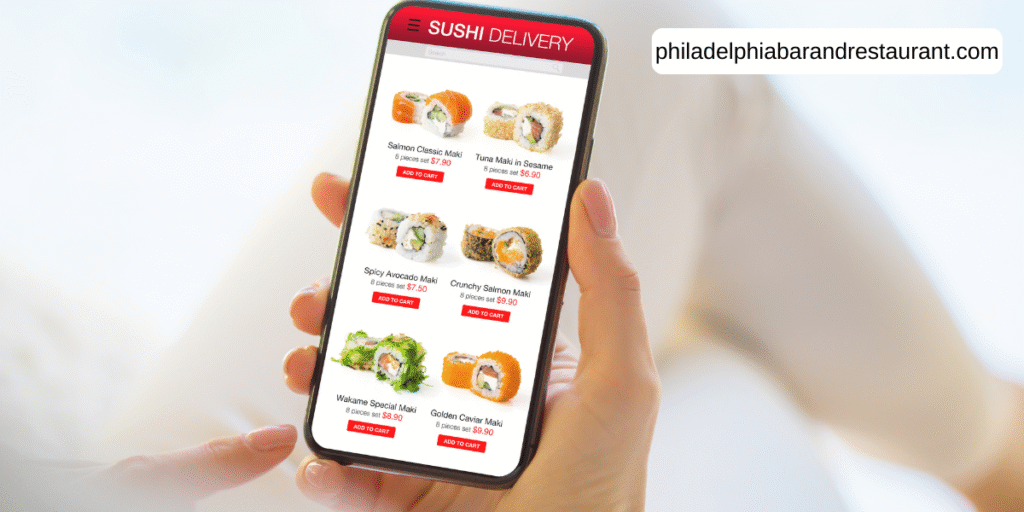
Over 60% of restaurant searches happen on mobile devices, where tiny decorative fonts become impossible to read. When customers squint at their phones trying to decipher your menu descriptions, they simply move on to a competitor with better readability.
The issue gets worse in bright sunlight or dimly lit environments, where contrast between text and background determines whether anyone can actually see your offerings.
The good news is that fixing these readability problems delivers measurable results. Strategic use of good typography can improve website performance by 20-35% through better readability and reduced cognitive load.
On top of that, clean fonts, proper sizing, and clear hierarchy guide visitors through your site and directly boost conversions. When customers can easily scan your menu, find your location, and complete a reservation or order, your bottom line ultimately improves.
The Role of Typography in Building (or Breaking) Restaurant Brand Trust
The best part about good typography is that it builds customer trust before anyone reads your menu. Let’s break down how typography shapes trust and what happens when you get it wrong.
Font Psychology: What Your Typeface Says About Your Restaurant
Font choices signal your restaurant’s quality level and professionalism before customers read one word. When someone lands on your site, their brain processes your typography in milliseconds and forms an instant judgement.
For example, A fine dining restaurant using Comic Sans sends confusing signals about quality. Or a trendy cocktail bar with old-fashioned fonts feels outdated before visitors even check the drinks menu.
The Handwritten Effect on Customer Perception
Research found that handwritten typeface styles make food appear healthier and increase social sharing. When customers perceive your food as higher quality based on fonts alone, they become more willing to order and share their experience with friends.
Why Brand Consistency Across Platforms is Important
If this sounds like your restaurant, here’s the problem. Inconsistent fonts across your website, printed menu, and social media damage brand recognition and cost you revenue. In fact, research shows that consistent branding can increase revenue by 23%.
When PBR Web Design works with restaurant clients, we often find they’re using three different fonts on their website, completely different ones on their physical menus, and random choices on Instagram posts.
Your fonts should match your restaurant’s actual atmosphere and carry through every customer touchpoint.
5 Typography Mistakes That Cost Restaurant Websites Customers
Ever notice how some restaurant websites just feel more professional than others?
The difference often comes down to typography mistakes you might not even realise you’re making. You’re not alone if you’ve struggled with choosing fonts or wondered why visitors leave so quickly.
Let’s look at the five biggest problems and how to fix them.
Mistake #1: Decorative Fonts for Menu Descriptions
Using elaborate script fonts might look fancy, but they sacrifice readability. When customers can’t quickly scan your menu offerings on mobile devices, they simply close the tab and move to a competitor.
To fix this issue, reserve decorative fonts for headlines only. Then use clean sans-serif fonts like Helvetica or Montserrat for body text and menu descriptions.
Mistake #2: Poor Contrast Between Text and Background
Light grey text on a white background might look modern in your design software, but it fails accessibility standards and disappears completely in sunlight. Check your contrast ratios using WebAIM’s tool and aim for at least 4.5:1. Black text on white background remains the most readable combination for restaurant menus.
Mistake #3: Too Many Competing Fonts
We see this constantly at PBR Web Design. Restaurant owners get excited about fonts and use different ones for every page section, which creates visual chaos.
Limit your site to two or three fonts maximum. Use one for headings, one for body text, and optionally one accent font for special elements like your logo.
Mistake #4: Font Sizes Too Small for Mobile
As we’ve already mentioned, over 60% of restaurant searches happen on mobile devices. That’s why text below 16px becomes unreadable on phones, especially for older diners.
We suggest setting your body text to a minimum of 16px and scaling up for headings. Then test your menu on an actual phone in bright sunlight to see what customers really experience.
Mistake #5: Slow-Loading Custom Fonts
Fancy custom web fonts delay page rendering while hungry customers wait. Every one-second delay reduces conversions by 7%. Use Google Fonts for free, fast-loading options, or stick with system fonts that load instantly. Your site speed affects both customer experience and search rankings.
Fix even one of these mistakes, and you’ll see fewer visitors bouncing away from your restaurant website.
Typography Choices That Turn Visitors Into Customers
Now that you know how typography affects your bottom line, here’s what to do next.
Typography directly controls whether customers can read your menu, trust your brand, and place orders on your restaurant website. Start with one fix today.
We recommend starting with auditing your mobile readability in bright sunlight. Check your contrast ratios using the free WebAIM tool. Limit your fonts to a maximum of three to ensure consistency across your website, physical menus, and social media posts.
Either tackle these changes yourself or work with experts like PBR Web Design to get the job done. Just remember that good typography works quietly in the background, making your restaurant website easier to read, more trustworthy, and more likely to convert hungry visitors into paying customers.


Post Comment